The Challenge
Hiking a new trail can be exciting, but sometimes it can be challenging to find what you want to hike. Current trail sites rely on user comments and tagging to determine a trail’s difficulty, but the pool of user fitness levels is too large and not taken into account to establish a trail’s actual difficulty. Hikers need an alternative way to find trails that are suited to their abilities.
My Role
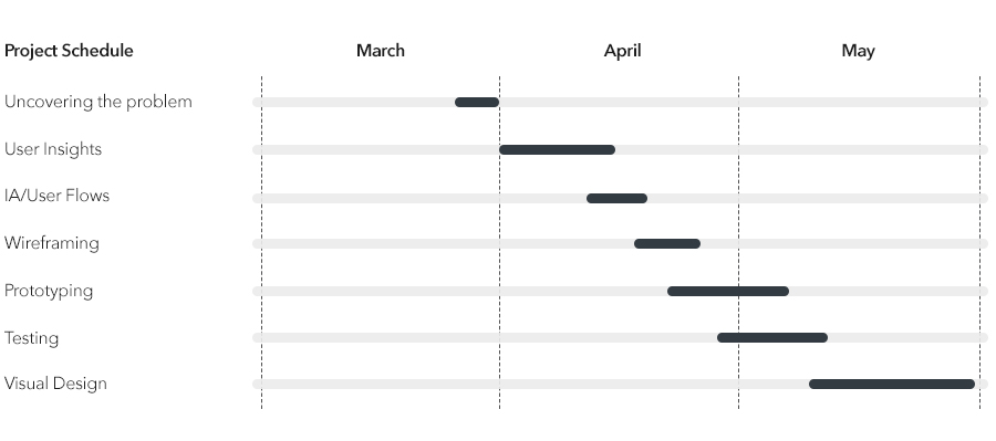
I led the User Experience and Interface of this project from March - May 2018.
Main Tasks:
- Customer Insights and ideation.
- Building the project vision.
- Design execusion and validation.
Deliverables
Research, personas, user flows, information architecture, wireframes, low and high fidelity screens.
Design and Research Tools

Discovery and User Insights
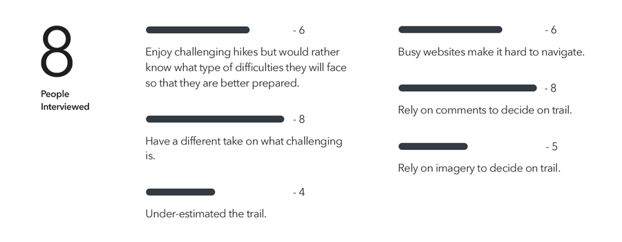
I conducted a research to understand the way people find trails to hike. It was essential to know pain points and pleasures to be able to create personas and determine MVP. I interviewed eight hikers ranging from beginners to expert levels.
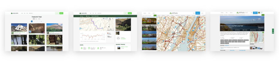
Analogous Products
I looked at how other products organized, filtered and displayed trails, namely Alltrails and Gaia Maps. Both had search engine and filters to give users the flexibility ti find trails but neither had recommended hikes or a more in tune service to learn and service their audience.
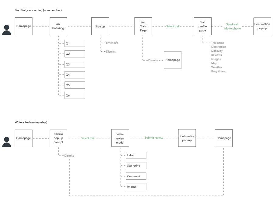
MVP and Information Architecture
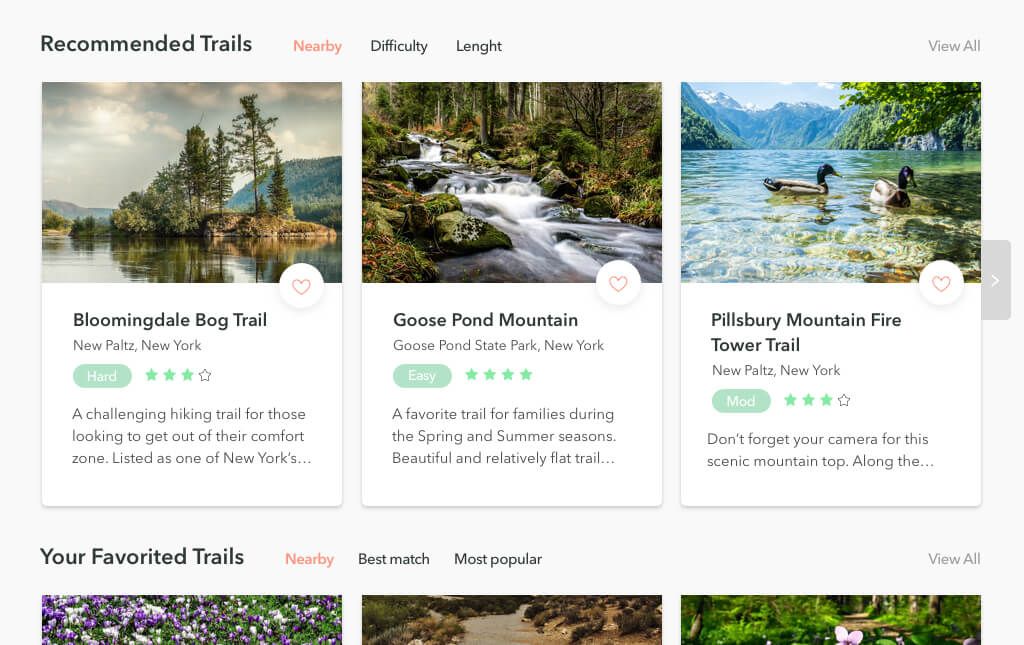
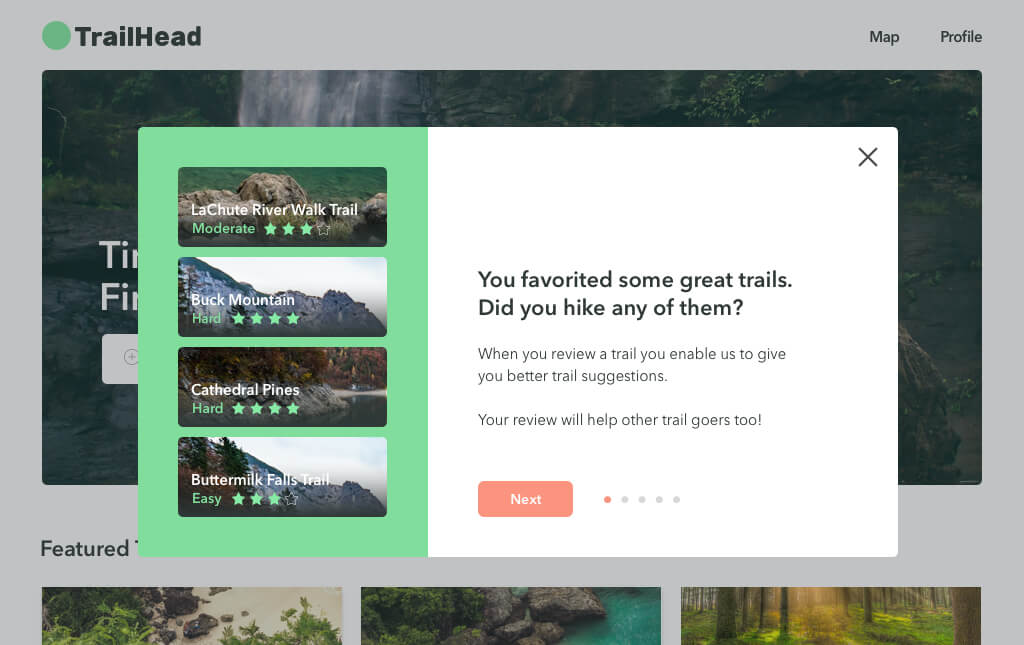
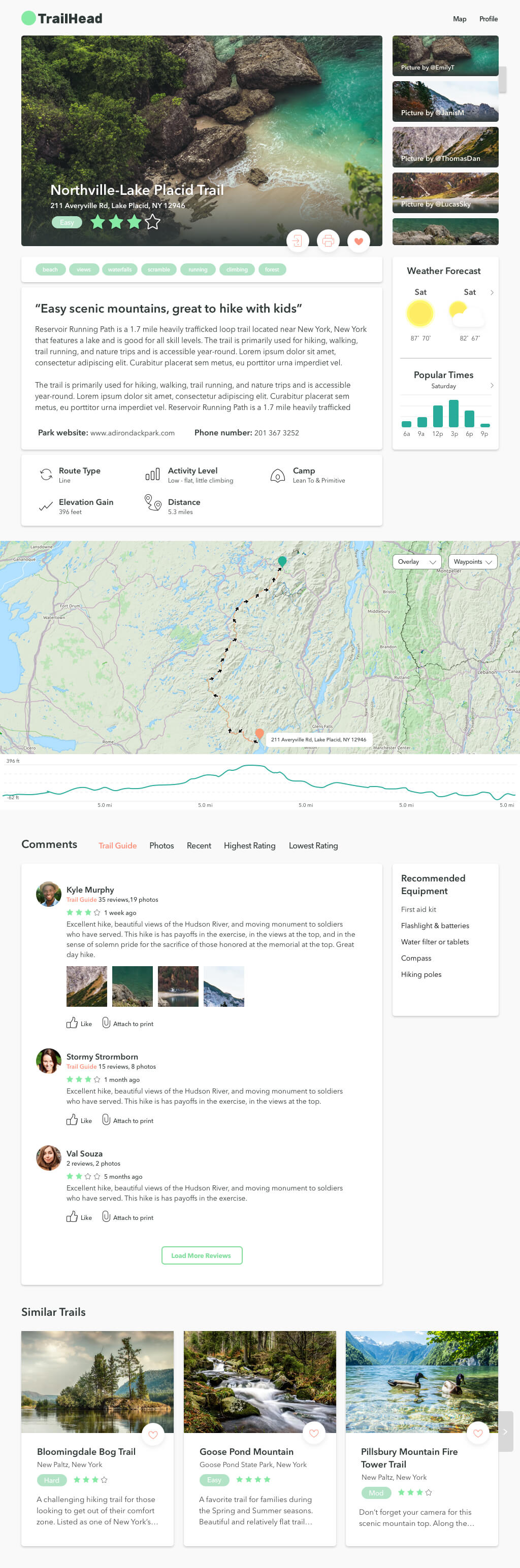
The MVP included features to help define the user’s abilities, needs and learned feedback. I was able to identify this with two tasks, onboarding, and reviews. The more people review hikes they go on, the smarter their hike recommendations and suggestions become.
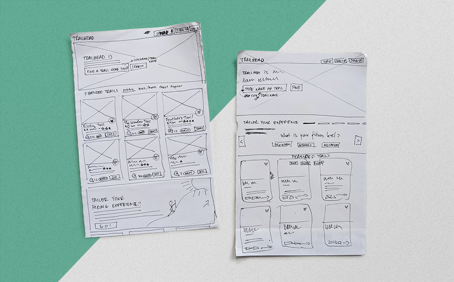
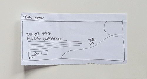
Lof-fi Wireframes
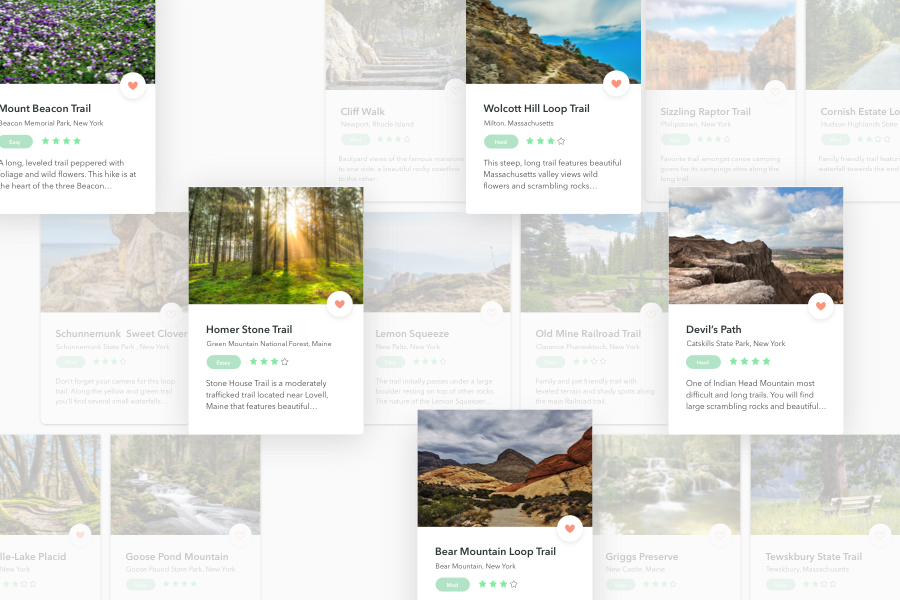
I created wireframes to test homepage page layout navigation, trail card metadata, MVP and data relevance in trail info page. I also experimented with placements for card buttons and different systems for filtering.
Main Tasks
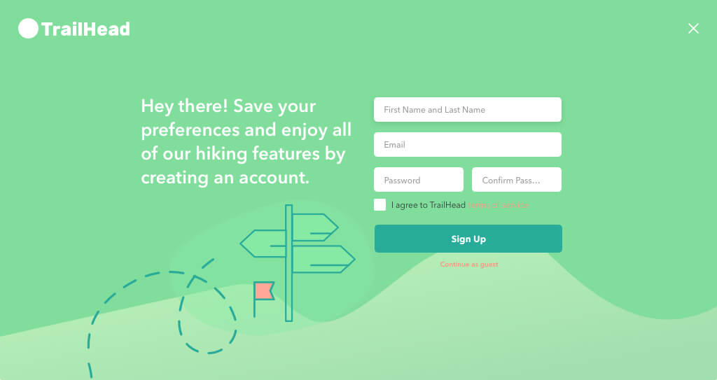
I wanted to reduce the friction of going through the onboarding process. I had to be careful to make the onboarding enjoyable, in a few screens as possible and yet still get crucial information from users to give them meaningful recommendations.
I needed the page layout to be intuitive. I opted for a clean and straightforward design mimicking successful website’s structures to reduce user cognitive load.
The write a review content strategy and how to present it was one of my major hurdles. I knew that users relied on reviews to pick their hikes. Therefore I needed them to share their hike experiences. I needed to ensure a bold, but not an intrusive way for users to write and share their reviews.
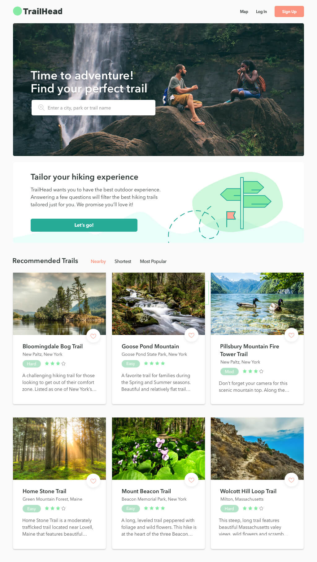
TrailHead’s three main features
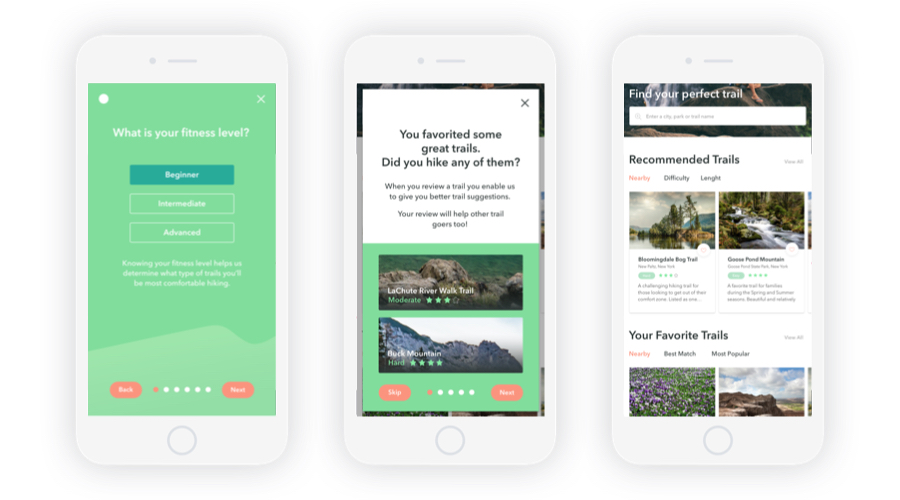
- User onboarding. The quickest way to find a trail that will fit your hiking needs.
- User review prompt. The more you review the hikes you go on, the better your trail recommendations.
- Saved recommendations. Your home screen will give you easy access to hikes previously recommended.
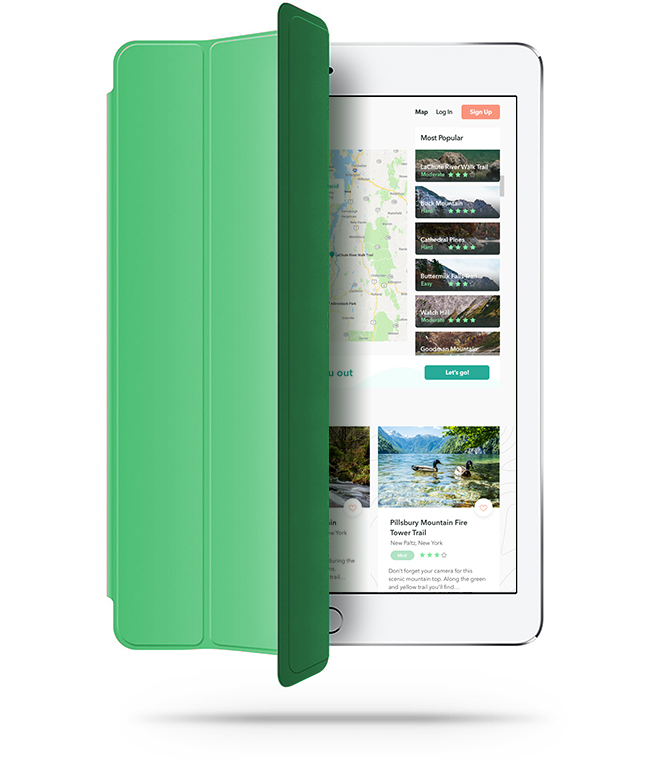
Visual Designs