The Problem
To increase user retention, Daily Burn launched 4-6 programs with individual branding every year. The programs rolled out on web, iOS, Android and various TV platforms. This extensive catalog of programs gave Daily Burn the competitive edge to keep up with fitness style trends and in turn, it helped users find their preferred workout style. However, because each program had individual branding and ambiguous cover art, users did not understand the workout style or that it belonged to Daily Burn.
My goals were to
- Unify all workout programs under Daily Burn’s brand.
- Clarify program art cover ambiguity.
- Create a cohesive uniform style that can evolve beyond current trends.
My Role
The Design, Marketing, and Production departments teamed up to create the project vision, gather customer insights, go through the ideation process and execute the design. I led the user interface, design and brand guideline efforts for this project. I worked closely with the UX lead designer to set design parameters for web, iOS, and other platforms. I collaborated with marketing and production departments to develop improved content naming and photoshoot guidelines.
The Inspiration
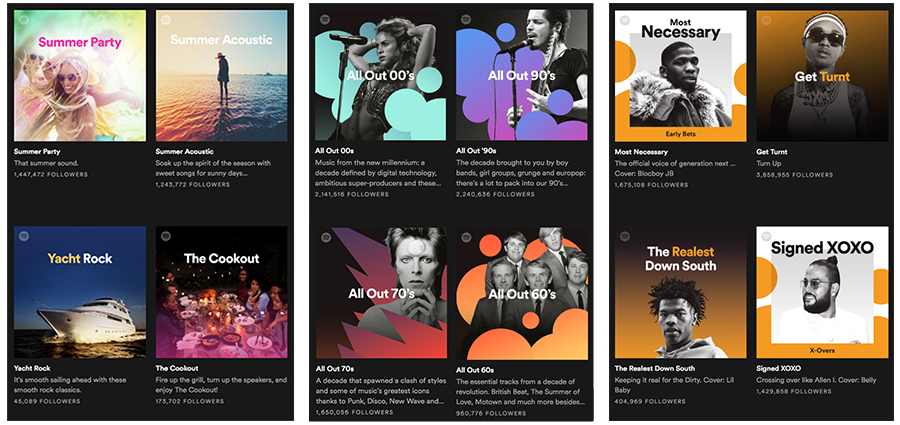
Spotify
Spotify’s brand identity system allows Spotify to be recognized immediately. Font and copy placement is the predominant factor of every cover. Each cover evokes feelings depending on the artist or music style. I was inspired by Spotify’s evolution beyond its memorable duotone covers to incorporating more shapes, colors and lifestyle photography.
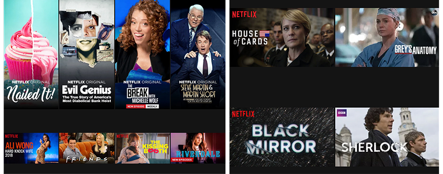
Netflix
Netflix is able to collect its Netflix originals and the extensive catalog of partner movies and shows under the Netflix brand. Its platform shows a captivating balance between Netflix branding, partner branding, typography and graphic styles. My biggest takeaway from Netflix cover art is the originals’ use of type and bold imagery. The cover creates a visual cohesiveness throughout the product that engages, tells a story and helps drive decisions.
User Insights and Naming
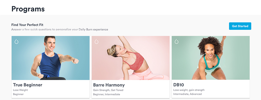
During phase one of this project, we decided to roll out Daily Burn’s popular and newest programs. Our collected data showed that True Beginner was the most completed program along with the latest four programs launched: Mobility, Barre Harmony, DB10 and Yoga Fundamentals. Every future program would follow the new design system.
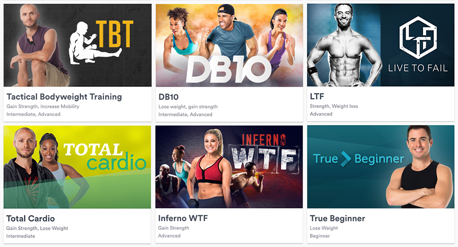
Program names like Undefeated, TBT and Inferno WTF were a source of confusion for users. The names were not representative of the workout style and even some of the cover art images lacked the program’s character. We decided to start naming programs depending on the type of workout, ex: Mobility: a workout to increase flexibility and Yoga Fundamentals: a basic moves yoga program.
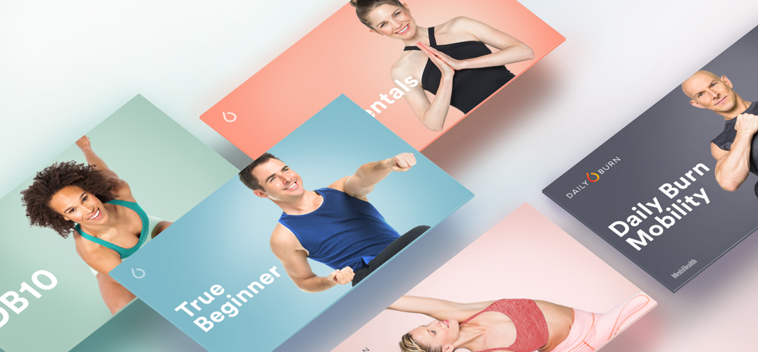
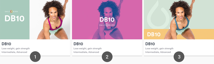
Variations, Testing and Solution
We needed the program art to be clean, exciting and straightforward. Like Spotify and Netflix covers, Daily Burn’s cover art had to engage users, convey emotions and drive decisions. We tested this idea via colors and image silhouetting. Below are variations of the cover art on the Daily Burn platform.
Foreseeable Problems
1. Because of the information architecture, prototype #1 would disrupt the harmony of the layout structure. It would also be challenging to fit longer program names in the allotted space.
2. This prototype worked for every product layout; it was clean, bright and could fit longer program names. We liked the bold duotone effect, but the style was starkly different from what was currently hosted on the site.
3. We found this prototype to also be combating with the content structure of the Daily Burn platform. The introduction of color and the Daily Burn icon gave the art depth, but we still felt that is was not a good fit for other partner platforms.
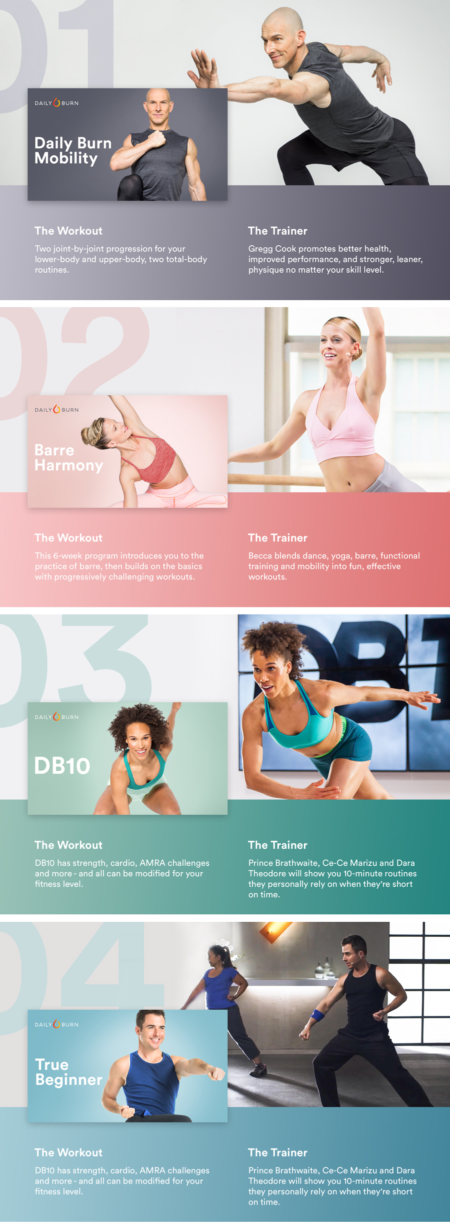
Solution: Layout for different platforms
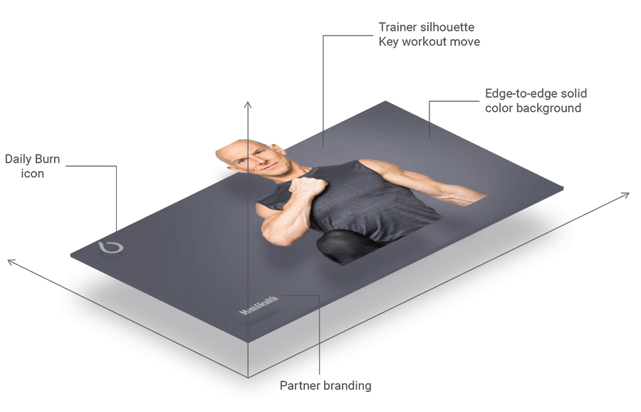
Our solution was to keep only the essential elements. The new program art is clean, bold and it doesn’t disrupt the structure of the page. Most importantly, it clearly defines the program. Elements include an edge-to-edge color background, the program trainer in a key workout move, the Daily Burn icon, the program name and partner branding.
On partners’ platforms, the Daily Burn logo and the name of the program are to be placed on the art.